Flex a Pivot Table to show data for x months ended a certain user defined month

{ 4 Comments }

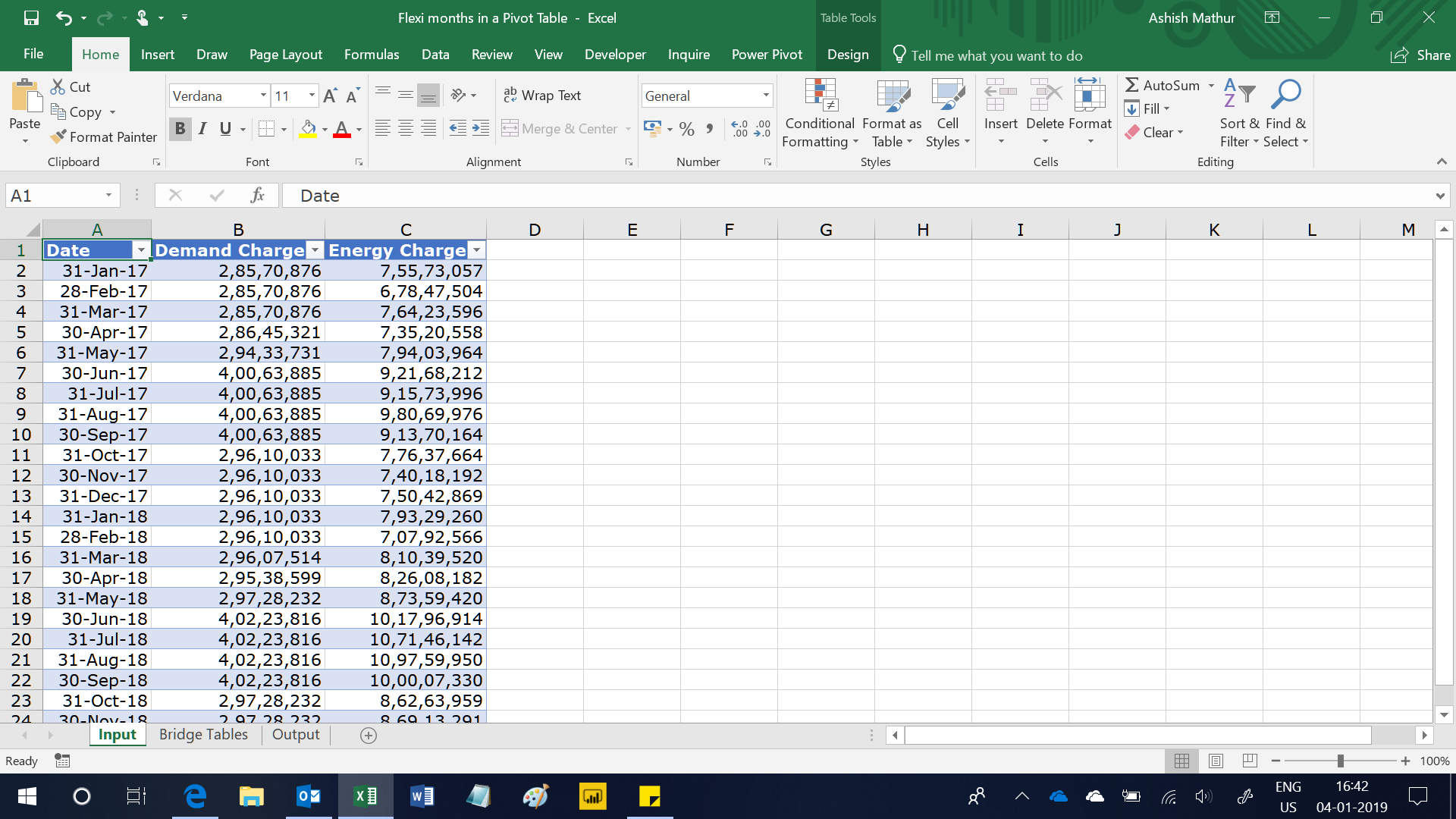
In this simple 3 column dataset shown below, one can see the month wise demand and energy charge for 2 years – 2017 and 2018.

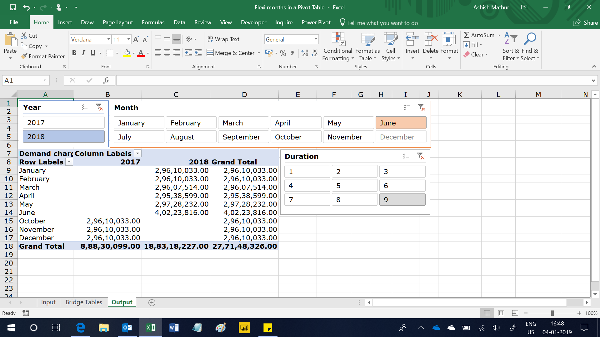
The objective is to compute the month wise demand charge for x months ended a certain user defined Year and Month.  So, if a user selects the Year as 2018, Month as June and Duration as 9, then the Pivot Table should show month wise demand charge for the 9 months ended June 2018 i.e. from October 2017 to June 2018.  Likewise, if a user selects Year as 2018, Month as May and Duration as 3, then the Pivot Table show should month wise demand charge for the 3 months ended May 2018 i.e. March 2018 to May 2018.

You may download my solution workbook from here.

Leave a Comment

Your email address will not be published.

*

  • Hi Ashish,

    thank you very much for the great work. This is exactly what I would like to achieve, but I am afraid I need a bit more help from you to understand how it works, since I cannot see what are the source data of your Pivot Table and I cannot really follow the mechanic on how it is changing by clicking the slicer. Where are the calculations to understand which month to plot performed?

    I would need a bit of help and guidance from you to try and reproduce it in my file.

    Many thanks for your help and support.

    • Hi,
      You are most welcome. The source tables required, for generating the output, are present in 2 worksheets – Input and Bridge Tables (a total of 5 tables). Here is the process:

      1. Load each of the 5 tables to the PowerPivot
      2. Create relationships between the multiple tables while in the PowerPivot window. In my solution file, you can review the relationships by going to Design > Manage relationships
      3. Close the PowerPivot window
      4. Build your Pivot Table by dragging Year and Month from the Calendar Table
      5. Build slicers for Duration, Year and Month. The slicer for Year and Month should be built from the Calendar_dup table
      6. You then write the measures that I have written. You may view the measures by going to PowerPivot > Measures > Manage measures
      7. You simply drag the “Demand charge in past x months” measure to your Pivot Table

      Hope this helps.